Sticker Slap
Stickers on laptops and water bottles live or die by the lettering. Today the whole class builds three Halloween slogan stickers for campus life: "Midterm Zombie," "Quiet Floor Ghost," and "Free Candy Here." You set one slogan in a heavy font, build a chunky three-layer look in the Appearance panel (an orange fill, a navy outline, and a jagged navy shadow), save it as a Graphic Style, and reuse it on the other two. One slogan rides a curved path. There is no starter file: you make your own document.
Shortcuts are written Windows / Mac. Example: Ctrl+G / Cmd+G. On a Mac, Option is the key some Windows lists call Alt.
We build together. Follow along step by step. When you finish a step early, wait at the check line or try the bonus at the bottom.
What you turn in
- Midpoint (Step 6):
LastName_TwoSlogans.jpg: a JPEG of the first two slogans, both with the full three-layer look. - Final (Step 8, or after the bonus):
LastName_StickerSlap.jpg: a JPEG of all three slogans, one on a curved path, all using the same saved Graphic Style. Keep yourLastName_StickerSlap.aifile for yourself. Do not upload it.
Downloads
StickerSlap_StudentFiles.zip: the one file for today: the class swatches. Unzip it before Step 1.StickerSlap_Swatches.ase: inside the zip, in the Palette folder. Four colors: Ink Navy, Pumpkin, Slime Green, Grape.
What we build today
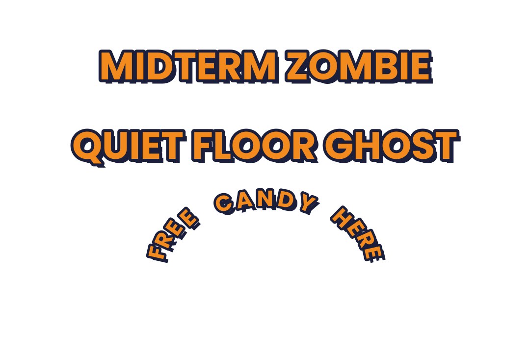
All three slogans sit on one 1800 by 1200 white artboard: slogan 1 on top, slogan 2 in the middle, the curved slogan 3 at the bottom.

Slogan 1: Midterm Zombie
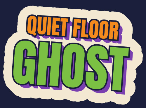
Slogan 2: Quiet Floor Ghost
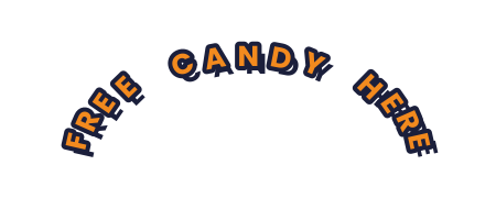
Slogan 3: Free Candy Here
What your files should look like
These images were drawn by a script to show the target look. They are an approximation, not an Illustrator file. Your jagged Zig Zag edge will look rougher than the script version, and that is fine.
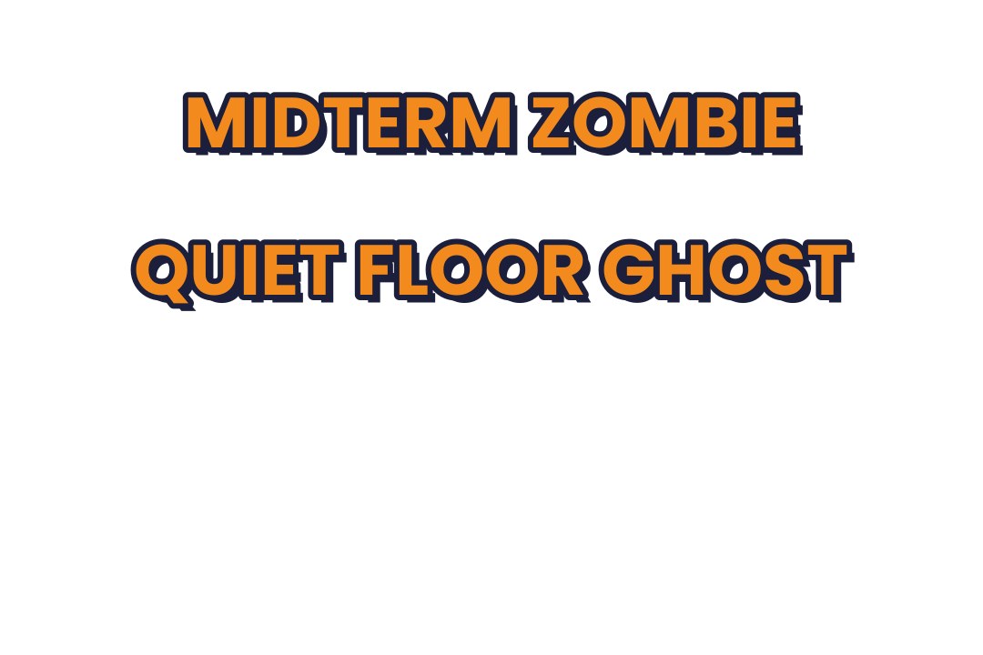
Midpoint example
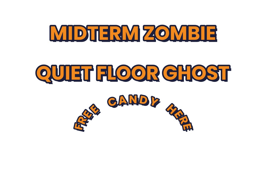
Final example
The class palette
Every color comes from these four. You load them as swatches in Step 1. To color a layer, select the layer's row in the Appearance panel, then click the swatch. Do not type hex codes on individual objects.
| Swatch | Name | Hex | Used on |
|---|---|---|---|
| Ink Navy | #1B1F3B | Every outline and the offset shadow | |
| Pumpkin | #F28A1E | The top fill of every slogan | |
| Slime Green | #7BC043 | Optional recolor of one slogan | |
| Grape | #7A3FB0 | Optional recolor of one slogan |
Quick refresher: Photoshop to Illustrator
You have used layer styles in Photoshop. Here is how today's ideas map over.
| Photoshop | Illustrator |
|---|---|
| Type layer, then a Character panel | Type tool T and the Character panel (Ctrl+T / Cmd+T). Click once for a line of text. Dragging a box makes a text frame instead. |
| Layer Style: Stroke, Drop Shadow, Color Overlay | Appearance panel (Shift+F6). Each fill, stroke, and effect is a row you can reorder. |
| Save a Layer Style, drop it on another layer | Graphic Styles panel (Shift+F5). Save the stack, click it on another slogan. |
| Warp Text | Effect > Warp. It stays live and editable on the type. |
| Rasterize Type | Create Outlines (Ctrl+Shift+O / Cmd+Shift+O). The letters become shapes. Here the appearance stack stays live. |
| Smart Object fonts from Adobe Fonts | Same Adobe Fonts library. Click a font in the list and it activates. |
Class plan
| Start | Minutes | What | How |
|---|---|---|---|
| 0:00 | 2 | Opening: why stickers need a stack | Demo |
| 0:02 | 6 | Step 1: New document and swatches | Do along |
| 0:08 | 9 | Step 2: Type the slogans and pick a font | Do along |
| 0:17 | 10 | Step 3: Build the fill, outline, and shadow stack | Do along |
| 0:27 | 7 | Step 4: Offset the shadow and rough up the edge | Do along |
| 0:34 | 5 | Step 5: Save a Graphic Style and use it | Do along |
| 0:39 | 3 | Step 6: Midpoint turn-in | Gate |
| 0:42 | 9 | Step 7: Put slogan 3 on a path | Do along |
| 0:51 | 7 | Step 8: Create Outlines and final export | Turn-in |
| 0:58 | Core ends. Midpoint and final turned in. | ||
| 0:58 | 8 | Step 9: Bonus arch with Effect > Warp | Bonus, ahead students only |
| 1:06 | Bonus ends. Optional steps. | ||
Steps
New document and swatches
about 6 min- Choose . Click the Print or Web tab if needed, then type
1800for Width and1200for Height. Set the units to Pixels. Set Color Mode to RGB. Click Create. - Choose . Set the format to Adobe Illustrator (ai). Name the file
LastName_StickerSlap.aiand click Save. Click OK in the options box. - Unzip
StickerSlap_StudentFiles.zip. Open the Swatches panel with . Click the Swatch Libraries menu at the bottom left of the panel (the same menu as Sessions 2 and 3), choose Other Library at the bottom of the list, pickStickerSlap_Swatches.asefrom the Palette folder, and click Open. A new panel appears with four swatches. - Drag each of the four swatches from that new panel into your own Swatches panel, or click the small "Add to Swatches" button at the bottom of the library panel. Close the library panel.
- Open the Appearance panel with (
Shift+F6) and the Graphic Styles panel with . Leave both open. If panels cover the artboard, close the ones you do not need with their X.
If not: If the swatch library will not open, check the Save step: the file must be a real .ai. If the four colors are missing, ask for the file again. You can also type the hex codes from the class palette table above the steps.
- The class build needs the same artboard size so slogans land in the same place.
- Close extra panels. A floating panel over the artboard hides your work.
Type the slogans and pick a font
about 9 min- Press
Tfor the Type tool. Click once on the left side of the artboard near the top. Click, do not drag. A drag makes a text frame (area type) and may hide text. - Type
MIDTERM ZOMBIEin capital letters. To leave the text box, click the black arrow in the toolbar (the Selection tool). Do not press Esc and then type: the letters fire tool shortcuts. - With the text selected (click it with the black arrow), open (Ctrl+T / Cmd+T). Click the font name field. Open the Discover More tab. Click a heavy, chunky display font in the list. It turns on at once and applies to your text. If nothing loads, type
Arial Blackin the font field instead. - Set the size to
130pt. Move the text so it sits near the top of the artboard. Use the Properties panel: type900for X and200for Y with the center square of the Reference Point grid filled. - Press
Tagain and click below the first slogan. TypeQUIET FLOOR GHOST. Click the black arrow to leave. Select it and set the same font and130pt. Place it at900X,480Y. - Leave the third slogan,
FREE CANDY HERE, for Step 7.
If not: A small red plus at the corner of the text means area type with hidden text. Delete it and click, do not drag. If the font looks like mixed small caps, pick a different font or use Arial Black.
- Click, do not drag.
- Preview the font with your actual slogan. Some fonts show capitals as small caps shapes.
Build the fill, outline, and shadow stack
about 10 min- Click the first slogan with the black arrow (
V). Look at the Appearance panel. It showsTypeand one row,Characters. - Click the Add New Fill button at the bottom of the Appearance panel (the second square icon). A new Fill row appears above Characters. Set its color to Pumpkin: click the row's color square, then click the Pumpkin swatch. Click an empty spot in the panel to close the swatch pop-up. A Stroke row set to none may also appear. That is normal.
- If a Stroke row is already in the list, click it. If not, click Add New Stroke (the first icon at the bottom). Set its color to Ink Navy and its weight to
20pt. Then open and click the Round Join button next to Corner. Only one Stroke row should be in the list. - Click Add New Fill again and set it to Ink Navy. This is the shadow. You will move it in Step 4.
- Drag the rows until the order from top to bottom is: Fill (Pumpkin), Stroke (Ink Navy), Fill (Ink Navy), Characters. Drag a row by grabbing an empty spot on the right side of the row, not the word Fill or Stroke. Dragging the word does nothing. The easy way: drag the row you want on top up above the first row, and repeat as needed.
If not: If the letters look navy, the navy Fill is above the orange one. Drag the Pumpkin Fill to the top. If the outline covers the letters, the Stroke is above the Pumpkin Fill: drag the Stroke below it.
- Row order is the whole trick: top row paints on top.
- Select a row before you change a color: the color applies to the selected row only.
Offset the shadow and rough up the edge
about 7 min- Click the bottom navy Fill row in the Appearance panel (the one under the Stroke).
- Click the fx button at the bottom of the panel. Hover over Distort & Transform and move the mouse sideways into the submenu. Choose Transform. In the box, set Move Horizontal to
14px and Vertical to14px. Leave everything else alone. Click OK. - With the same bottom Fill still selected, click fx again. Choose Distort & Transform, then Zig Zag. Set Size to
5px, Ridges per segment to4, and Points to Corner. Click OK. - Look at the slogan. The navy shadow now sits down and to the right, and its edge is jagged. The orange letters and their outline stay clean.
If not: If the whole slogan moved or went jagged, the effect landed on the wrong row. Undo, click the bottom Fill row first, then add the effect. If the edge looks like thorns, the Zig Zag size is too big: reopen it from the row and use 5.
- Click the bottom Fill row before the fx button. The effect belongs to the selected row only.
- The Zig Zag default of 10 px is too spiky at this size. Use 5.
Save a Graphic Style and use it
about 5 min- Select the first slogan with the black arrow. In the Graphic Styles panel, click the New Graphic Style button (the plus icon at the bottom right of the panel). A new thumbnail appears.
- Select the second slogan,
QUIET FLOOR GHOST, with the black arrow. - Click the new thumbnail in the Graphic Styles panel. The second slogan gets the full orange, outline, and jagged shadow look in one click.
- Look at the Appearance panel for the second slogan. The header reads
Type: Graphic Style.
If not: If the second slogan turned black or got a gray fill, you clicked the thumbnail with no slogan selected, or the thumbnail is the wrong one. Undo, select the slogan with the black arrow, click the thumbnail again.
- Select the slogan first, then click the thumbnail.
- The style panel is in the same panel group as Appearance. Click its tab if you cannot see it.
Midpoint turn-in
about 3 minturn-in- Check that nothing else is on the artboard. Delete any stray text or shapes.
- Choose . Set the format to JPEG. Name the file
LastName_TwoSlogans.jpg. Check Use Artboards. Click Export. - In the JPEG Options box, set Quality to High and Color Model to RGB. Click OK.
- Upload
LastName_TwoSlogans.jpgto Canvas under the midpoint assignment.
LastName_TwoSlogans.jpg shows two slogans, both with the orange, navy outline, and jagged shadow look.If not: If the file is blank, Use Artboards was off or the slogans are off the artboard. Move them onto the artboard and export again.
- Name the file with your last name first.
- Wait 1 to 2 seconds after the dialog opens before typing the file name.
Put slogan 3 on a path
about 9 min- Press
Lfor the Ellipse tool. Drag in empty space at the bottom of the artboard to draw any ellipse. Click the black arrow. In the Properties panel, set Width to700, Height to420, X to900, and Y to890. In the toolbar, set Fill to None and Stroke to None. - Press
Tfor the Type tool. Hold Option (Mac) or Alt (Windows) and move the cursor onto the ellipse's edge at its far left point. The cursor changes to a small curve symbol. Click once. - Type
FREE CANDY HERE. Click the black arrow to leave. The letters ride along the top of the curve. Open the Character panel and set the same font as your other slogans and a size of80pt. - With the path text still selected, click the thumbnail in the Graphic Styles panel. The orange, navy, and jagged look flows along the curve.
- If the text runs off the right end of the curve or stops short, adjust the size a few points. To flip the text to the inside of the curve, choose , check Flip, and click OK.
If not: If the text appears inside a visible shape instead of on its edge, you used a plain click. Undo, hold Option or Alt, and click right on the edge. If the text starts at the wrong spot, drag the I-beam bracket at the start of the text along the curve.
- A plain click on a filled shape makes area type. The edge click needs Option or Alt.
- The ellipse has no fill and no stroke, so it never shows.
Create Outlines and final export
about 7 minturn-in- Select the first slogan with the black arrow. Choose (Ctrl+Shift+O / Cmd+Shift+O). The letters become shapes. The Appearance panel header changes to
Group: Graphic Styleand the orange, outline, and shadow rows are still there. - Press Ctrl+Shift+A / Cmd+Shift+A to deselect. Open the Layers panel (
F7). Check that no extra stray objects are on the artboard. - Choose . Set the format to JPEG. Name the file
LastName_StickerSlap.jpg. Check Use Artboards. Click Export. Wait 1 to 2 seconds for the options box, then set Quality to High and Color Model to RGB. Click OK. - Upload
LastName_StickerSlap.jpgto Canvas. Keep yourLastName_StickerSlap.aifile. Do not upload it.
LastName_StickerSlap.jpg shows all three slogans with the same look, one on a curve. The Graphic Style is applied to all three.If not: If a slogan is missing, it is off the artboard. If a slogan is plain black, the Graphic Style was not applied: select it and click the thumbnail. If the outlined slogan lost its effects, undo the outlines and check that the effects rows were present before outlining.
- Outlined text is no longer editable as text. Do this last.
- File name starts with your last name.
Bonus arch with Effect > Warp
about 8 minbonus- Select slogan 2 with the black arrow (if you outlined it, it is a group; this still works).
- Choose . Check Preview. Choose Horizontal and set Bend to
30%. Click OK. - Look at the Appearance panel. A new Warp: Arc row appears at the top. The type, outline, and shadow all arch together.
- To change it later, click the Warp: Arc row to reopen the dialog.
If not: If the arch is too flat or too tall, reopen the Warp: Arc row and change the Bend. Applying Warp breaks the link to the Graphic Style for that slogan, which is fine.
- The dialog can appear 1 to 2 seconds late.
- A warped slogan can run off the artboard. Move it back.
Final checklist
- I have three slogans on one 1800 by 1200 artboard.
- Every slogan has an orange top fill, a navy outline, and a navy jagged shadow.
- One slogan is on a curved path (Type on a Path).
- All three slogans use the same saved Graphic Style.
- No stray objects or guides are on the artboard.
- I exported with Use Artboards and the file name starts with my last name.
- I uploaded the JPEG, not the .ai.
Optional steps
Finished early? Do these in any order.
Recolor one slogan and redefine the style
about 7 min- Select the first slogan. Click the top Fill row in the Appearance panel and change its color to Slime Green or Grape by clicking the swatch.
- Look at the Graphic Styles thumbnail. Only slogan 1 changed. Its Appearance header now reads just
Typebecause you made a local edit. - Open the Appearance panel menu (the three lines at the top right) and choose Redefine Graphic Style.
- Look at the other slogans that use the style. They all change to match.
The reference sheet shows the finished look: three slogans, the third on a curve. It is an approximation drawn by a script, without the jagged Zig Zag edge and without the bonus arch.
Troubleshooting
| Problem | Fix |
|---|---|
| My text is a box and some words are missing. | You dragged with the Type tool and made area type. Undo, then click once. |
| I pressed Esc and typed, and strange shapes appeared. | Esc plus typing fires tool shortcuts. Undo until the shapes are gone. Use the black arrow to leave text. |
| The slogan is all navy. | The navy Fill is above the orange Fill. Drag the Pumpkin Fill row to the top of the Appearance panel. |
| The outline eats the letters. | The Stroke row is above the Fill row. Drag the Stroke below the top Fill. |
| The shadow did not move. | The Transform effect landed on the wrong row, or on nothing. Select the bottom Fill row first, then add the effect. |
| The jagged edge looks like thorns. | The Zig Zag size is too large. Reopen it from the fx row and use 5 px. |
| Clicking the Graphic Style thumbnail did nothing. | Nothing was selected. Select the slogan with the black arrow first. |
| My path text appears inside a shape. | You clicked the fill. Undo, hold Option or Alt and click right on the edge of a no-fill ellipse. |
| The text on the path runs off the end. | Reduce the size a few points, or use a wider ellipse. |
| Adobe Fonts will not load. | Use Arial Black or Impact. The look is the same. |
| The export is blank or cropped. | Check Use Artboards, and check that your slogans sit inside the artboard. |
What this project was actually about
In earlier sessions every shape was a drawing. Today the artwork is type, and the look is a stack of rows you can reorder, edit, and reuse. The Appearance panel and Graphic Styles are how professionals keep a logo or a set of stickers consistent. Next week you will map flat art onto a mug, and in the capstone you will use the same stack to build a wordmark for your own brand.
Tools used
- Type tool (point type) and the Character panel
- Adobe Fonts (Discover More)
- Appearance panel: add fills and strokes, reorder, add effects to a single row
- Effect > Distort & Transform > Transform and Zig Zag
- Graphic Styles panel: save, apply, redefine
- Type on a Path (Type tool plus Option or Alt on the edge)
- Create Outlines
- Effect > Warp (bonus)
- Export As JPEG with Use Artboards